


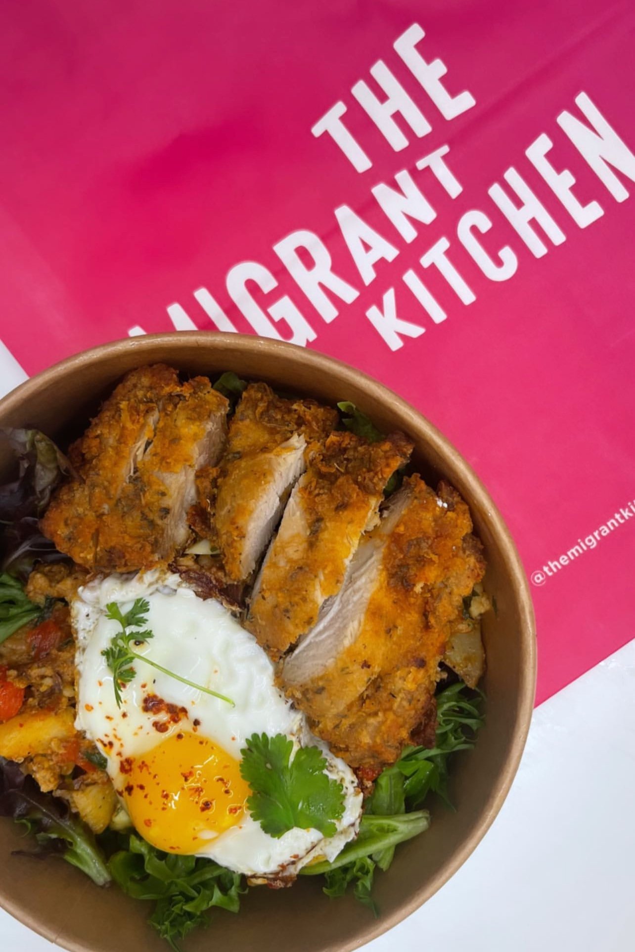
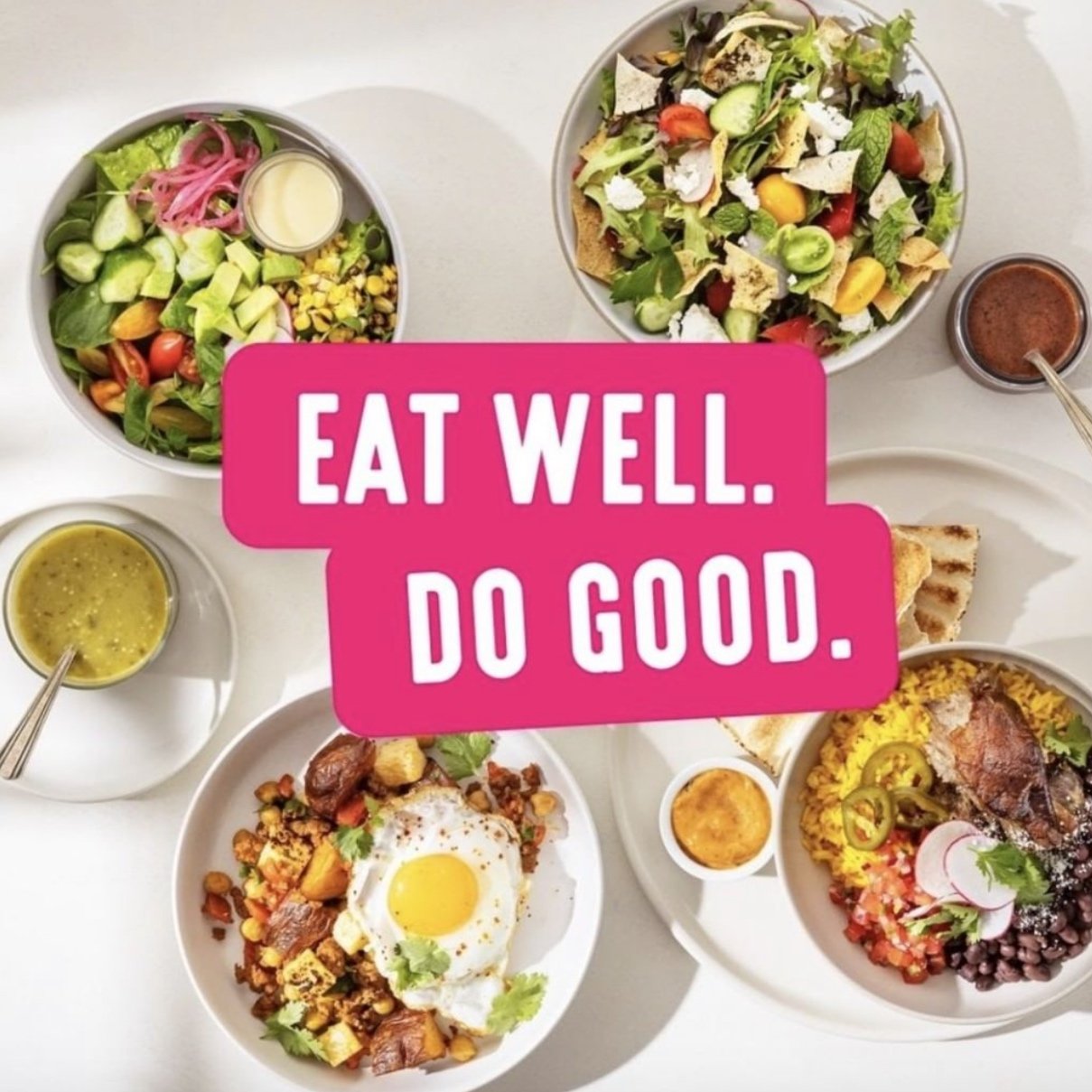
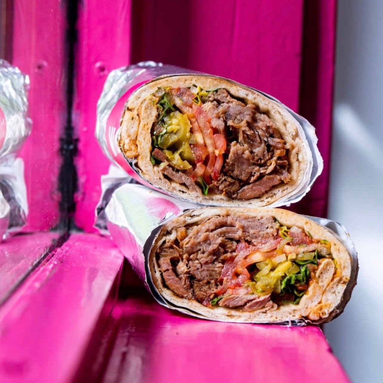
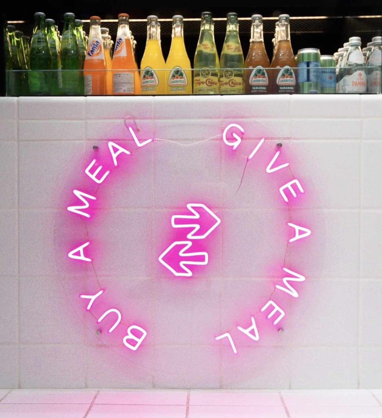


“Representing a migration of taste and technique from the Middle East to Latin America, the menu at The Migrant Kitchen pays homage to the cultural and culinary roots of Founders Nas and Dan. Rooted in the belief that food mirrors humanity: creative, collaborative... and a little non-conformist, a portion of every meal purchased goes toward providing meals to New Yorkers in need. EAT WELL. DO GOOD.”
Ahead of securing investment in support of ambitious growth plans, including multi-unit expansion, Agentsie was approached to refine the branding with aim to elevate communications and visibility in the ever-crowded fast casual sector. A new logo was designed with aim to capture the spirit and energy of the impassioned owners, with a nod to the intersectionality of the migrants the concept honors and serves. A subtle reference to directional signs at a crossroads informs the shape and dimension of the new mark while a bold pink, the chefs favorite color, is upheld for visual punch.
SERVICES PROVIDED:
Brand Development + Logo Design
Tagline Development
Construction Cover-up Design + Production
Exterior Signage Design + Production
Menu Board Design + Production
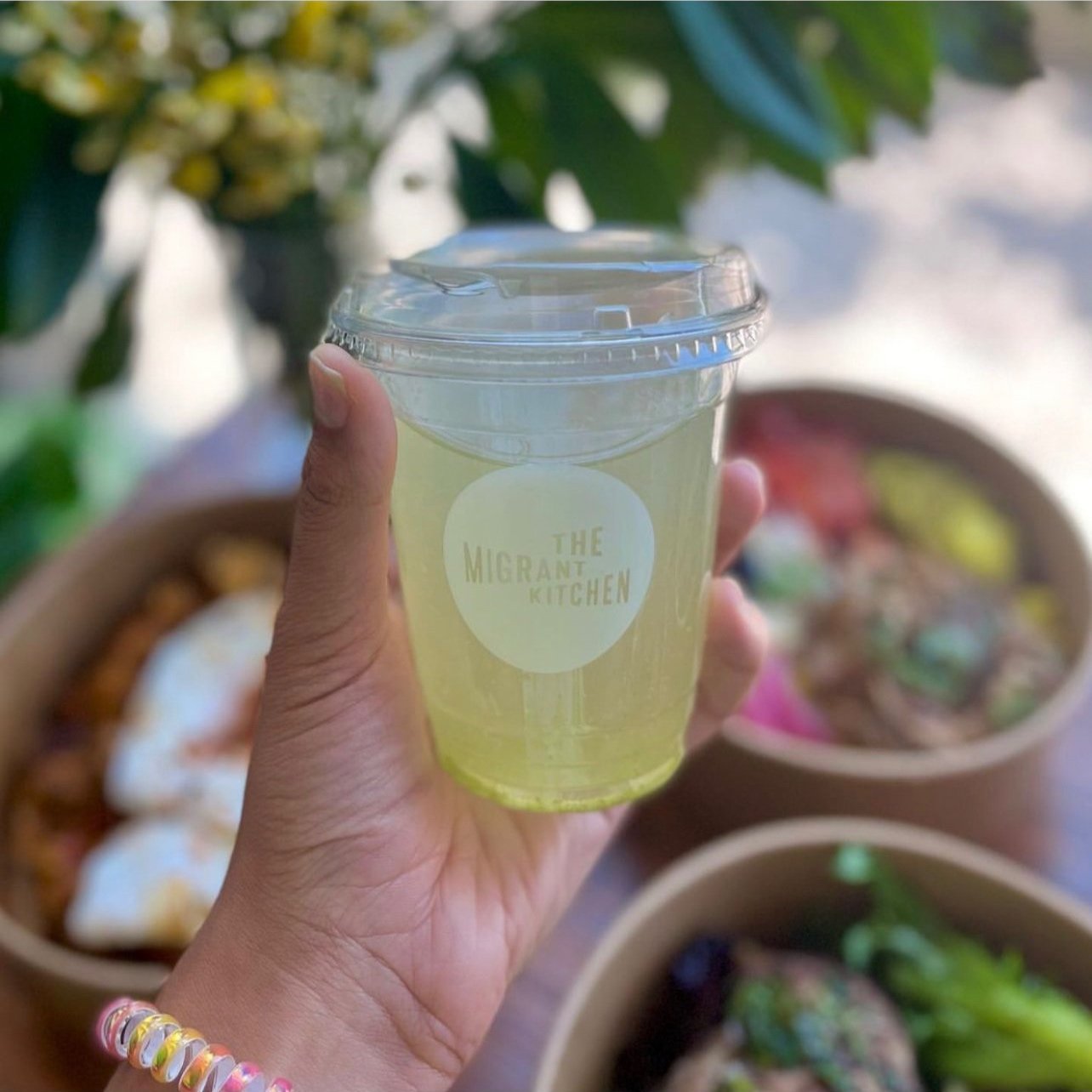
Take-Out Packaging Design + Sourcing
Uniform Design + Sourcing
Take-Out & Catering Menu Design
Promotional Window Cling Design + Production
Event Signage Design
Website Art Direction