


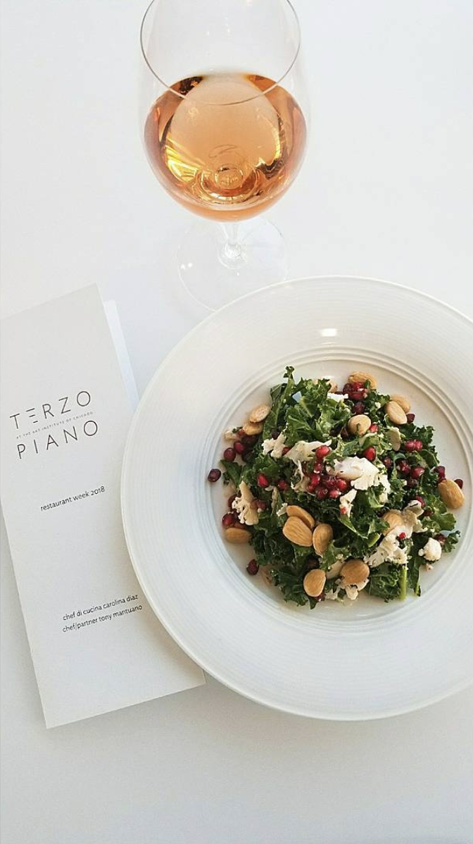
“Located in the Modern Wing of the Art Institute of Chicago, Terzo Piano features the signature cuisine of Chef Tony Mantuano, who has been delighting Chicagoans for years at the four-star Italian restaurant Spiaggia. The menu highlights local and regional organic produce and farm-raised meats and poultry.”
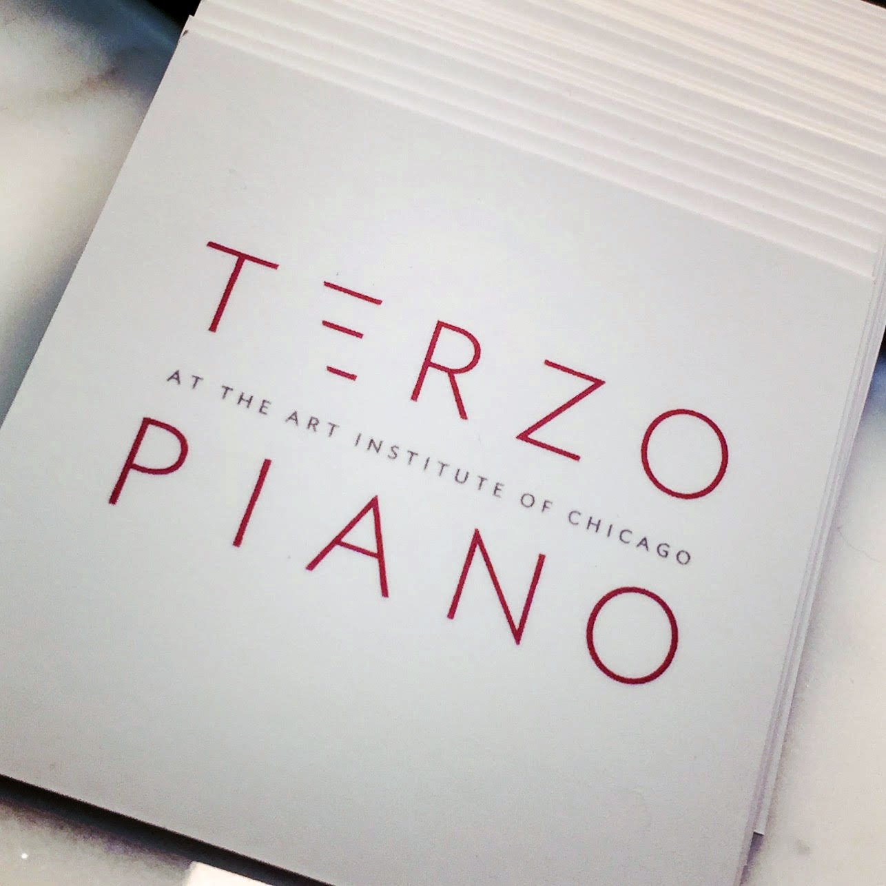
Ahead of refreshing the restaurant's original Renzo Piano interiors, Chef Tony Mantuano and Bon Appétit Management tasked Agentsie with creating a clean, more modern restaurant logo. Use of a sans-serif font - part of the museum's existing brand package - and a playful deconstruction of the letter 'E' subtly reference the restaurant's location on the third floor in the modern wing of Chicago's Art Institute. Dark orange lettering offers a departure from the restaurant's previous green and turquoise identity; reflecting striking interior design features within the space and adding a pop of color amidst a mostly white space.
SERVICES PROVIDED:
Brand Development + Logo Design